The Amazon Barclaycard
Transforming Amazon’s flagship UK credit card—simplifying sign-up, elevating design, and unifying the Amazon and Barclays experience.

Brief
The first project I led at Amazon was the design for the relaunch of a co-branded credit card. Customers wanted a card that offered compelling rewards, easy access to benefits, and a friction-free sign-up experience. With over 2 million existing cardholders, the relaunch aimed to grow to 2.8 million, increase spending, and make the card top-of-wallet.
Outcome
We successfully launched the co-branded credit card, delivering significant improvements over the previous experience: an 8.3% increase in application completion rates, an 11.7% reduction in time to submit, and a 31% decrease in application errors.
My role
As the Design Lead for this project, I was responsible for leading product design, research, branding, graphic design, and delivery. I led the end-to-end design process for on-Amazon user experiences and oversaw the experiences managed by our partner bank, ensuring a consistent user experience across both.
Toolkit
- Design:
- Figma · Adobe Illustrator, InDesign, and Photoshop · InVision
- Research:
- SurveyMonkey · UserTesting · Miro
01Working across all facets of design
On this project, I worked across product design, shaping the end-to-end customer experience—from onboarding to card management and all digital communications. I also led branding and graphic design efforts, including designing the physical card, creating sample prototypes to perfect the final product that would potentially end up in the hands of nearly 3 million people. In this case study, I’ll cover both the product design and branding aspects of the project.
02Product design — approach
My first task was to evaluate the existing experience, looking at the available quantitative data from our analytics tools, and using these findings as an input to the redesigned experience. We noticed a huge drop-off on the first page of the application form, which was a lengthy page encompassing most of the 17 of the application form questions.
My experience designing application forms taught me that presenting many questions on one page is likely to cause errors, lead to accessibility issues, and therefore reduce conversion. Splitting them into separate screens reduces cognitive load and minimizes mistakes. While this approach is widely adopted in modern app-first designs, it conflicted with Amazon’s long-standing philosophy of "fewer clicks = better UX."
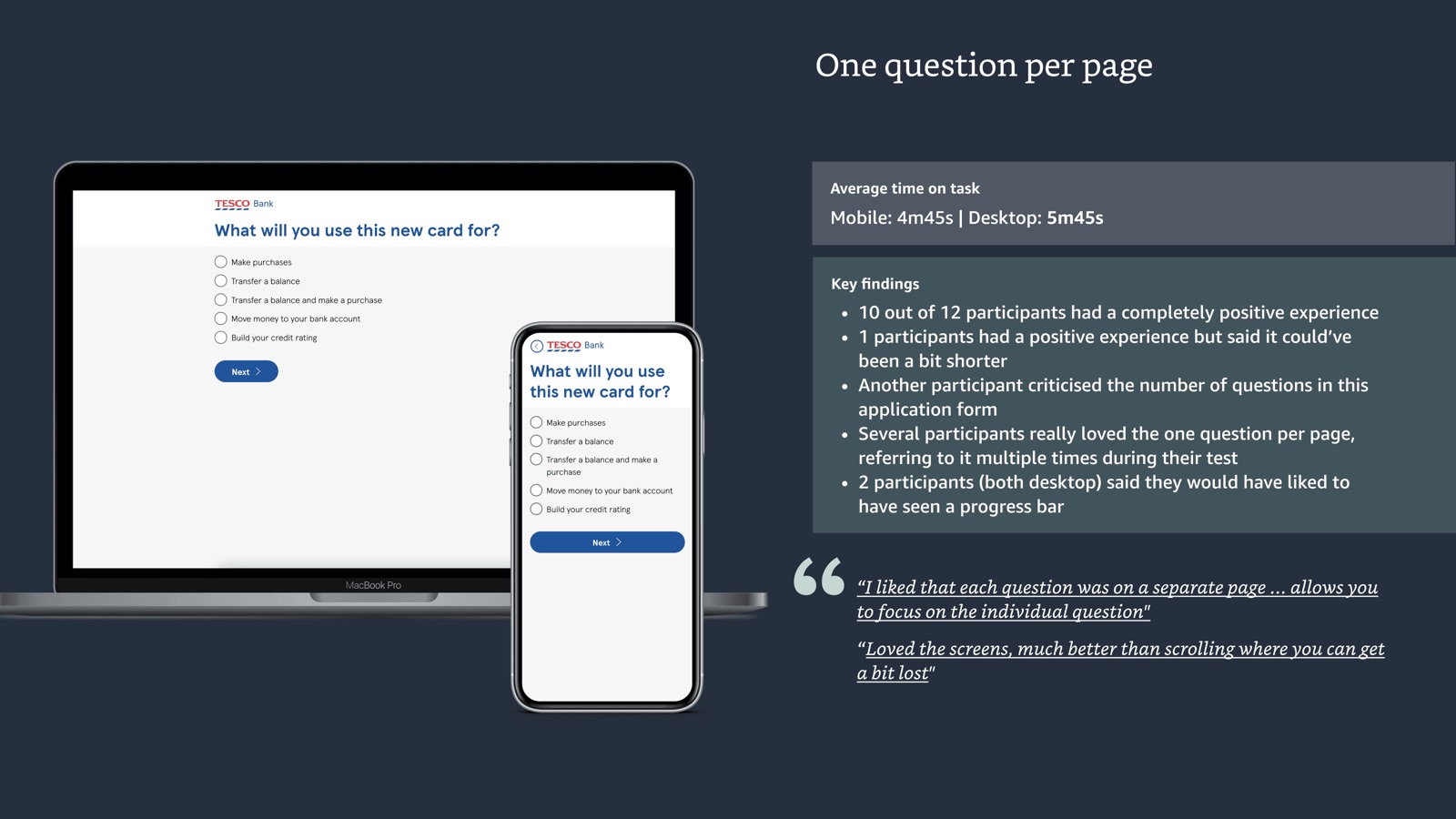
Despite sharing previous research, leadership needed more evidence, so I carried out a targeted study analyzing competitors credit card application forms, each with a similar number of questions but presented in different formats from one thing per page to having all questions on one page. As well as testing competitors live application forms, I created clickable prototypes based on the actual question set we would be using. The reason for testing competitors was primarily to replicate as closely as possible a real life scenario where a customer would spend time looking for their personal details needed to complete a credit card application, for privacy purposes we blurred participants screens as they entered sensitive information.
The research showed that one thing per page format performed best, with significantly fewer errors, as well as a comparatively quicker time to completion. Below is an extract of my research report.
03Delivery
This research allowed the team to align on the approach for the application form and identify improvements to the question set, enabling us to move forward with preparing designs for delivery.
For this relaunch, my design work focused on improving the application process, increasing conversions, and enabling on-Amazon card servicing. I redesigned the application form into a step-by-step format to reduce errors and improve user focus, collaborated with marketing to highlight the value proposition on the detail page, and introduced the first on-Amazon card servicing experience, allowing customers to track rewards and manage their card. I also designed email communications to keep users informed and engaged.
Designs were iteratively improved through customer feedback and reviews with product and engineering partners. Where possible, I used standard Amazon components. For custom components, I collaborated closely with the central design team to ensure brand alignment and facilitate reusability across other teams at Amazon.
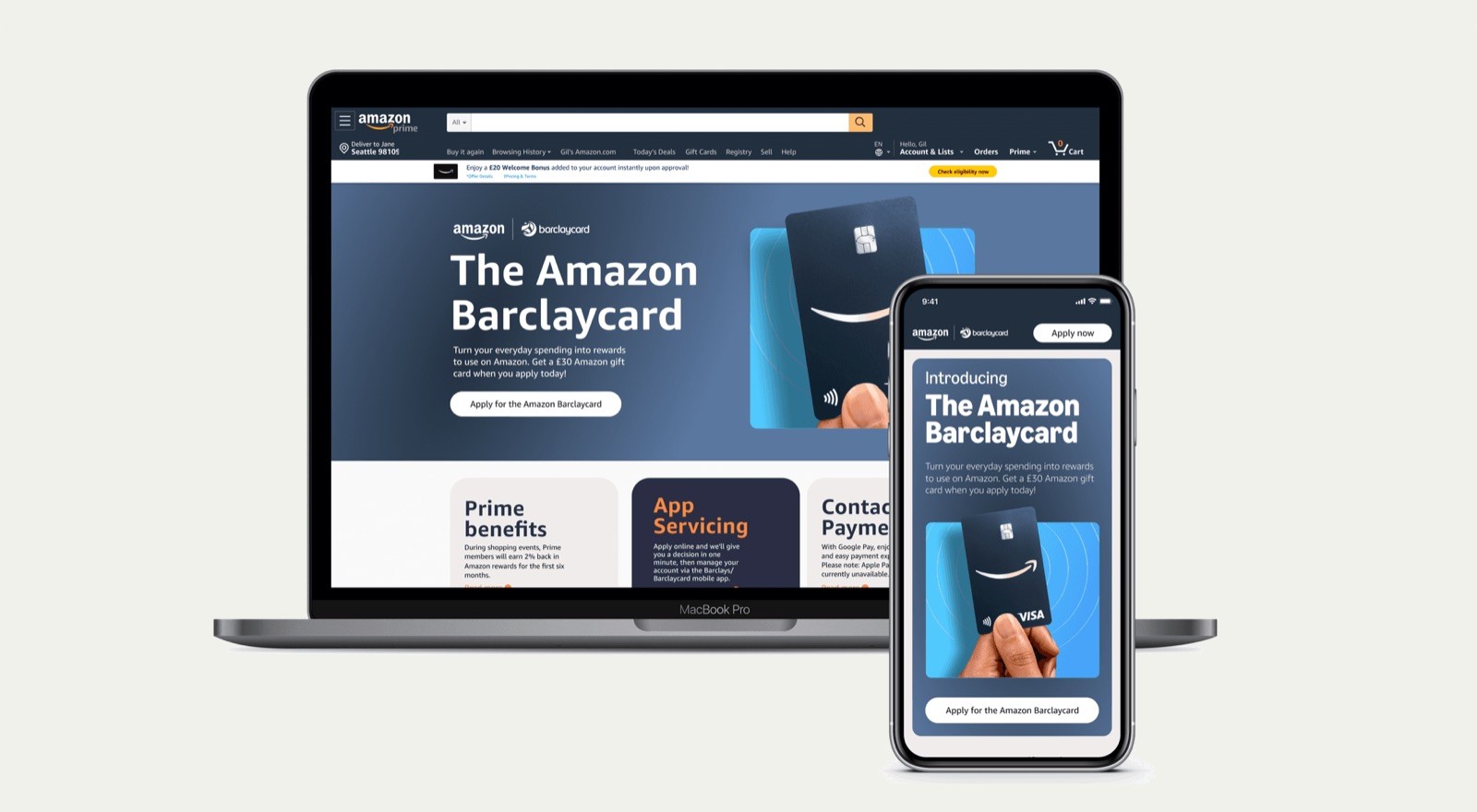
Product detail page: collaborated with marketing and brand teams to highlight the value proposition and drive conversions to the application process.
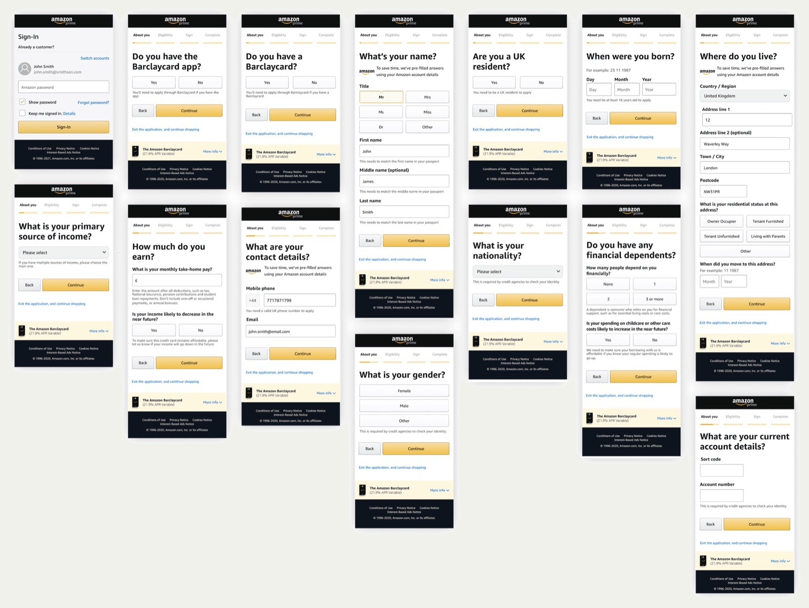
Application form: redesigned into a step-by-step, one-thing-per-page format based on research to reduce errors and improve user focus. Eligibility questions were placed at the start to minimize frustration for ineligible applicants.
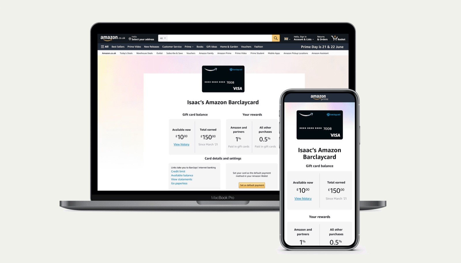
Card servicing: designed the first on-Amazon card servicing experience, launching with a minimal lovable product (MLP) that allowed customers to view their card benefits, track rewards earnings, and set the card as their default payment method.
04Graphic design and branding
As well as product design, I led the graphic design and branding efforts for the project - including the design of the physical card. This included working with an agency to create a cohesive identity for the co-branded credit card that resonated with users and aligned with both Amazon and Barclaycard’s branding standards.
05Card design and naming
I was responsible for leading the physical card design and naming process, overseeing all aspects from concept to implementation. Working with Barclaycard’s research agencies, I designed initial concepts for credit card designs and managed a large-scale study with approximately 2,000 participants. I reviewed and approved the research questionnaire, monitored the study's execution, and supported the analysis of findings.
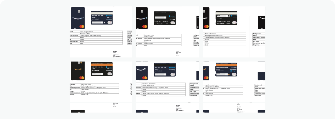
Based on the research, we narrowed down our options and I redesigned the front and back of the credit card, creating six distinct designs and working with the manufacturer to produce low-fidelity physical samples for further validation.
This work included making a strong case for brand approval, as this was the first instance of the Smile mark being featured prominently on a credit card. I was required to present to senior leadership on the final design and naming for approval, paving the way for teams globally to use this credit card design.
06Card design — validation research
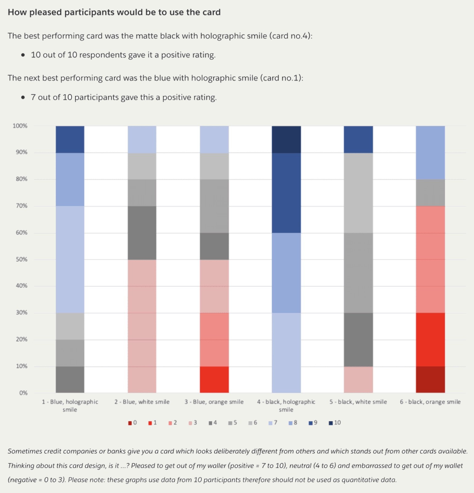
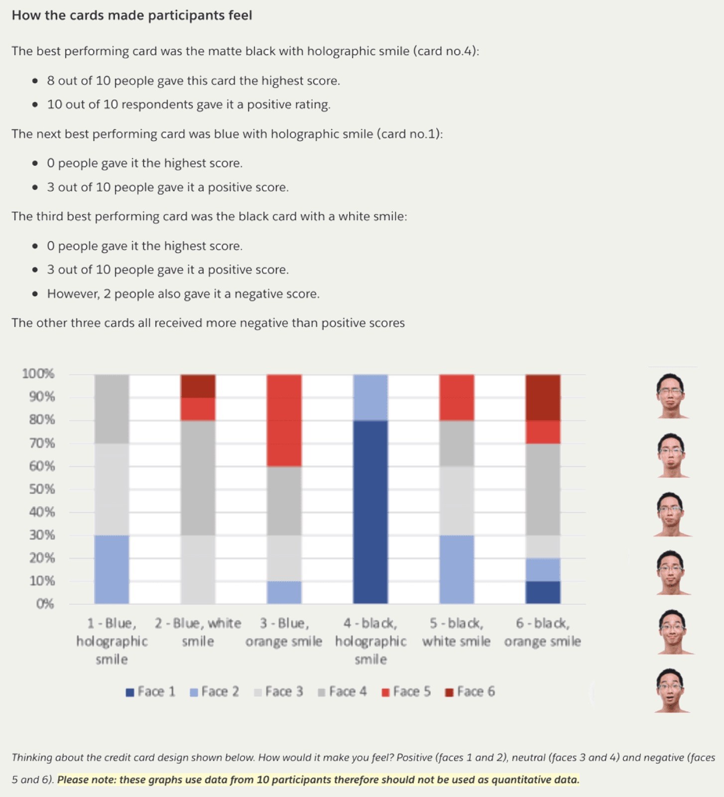
Due to tight production timelines, additional research activities were not planned after the first round. However, I initiated and conducted guerrilla testing within the office to validate the physical card designs. In under 24 hours, I completed the research with 10 participants, analyzed the findings, and documented the results. This effort revealed significant insights, leading to essential changes before production-level sampling.
07Card design — manufacturing
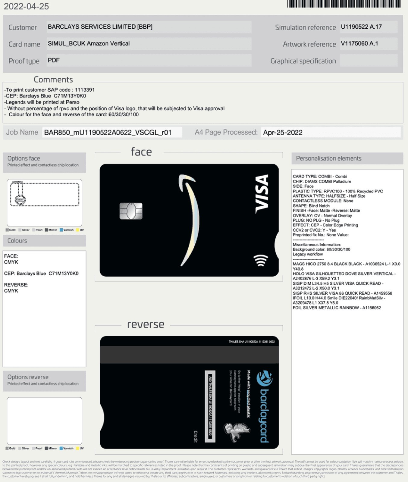
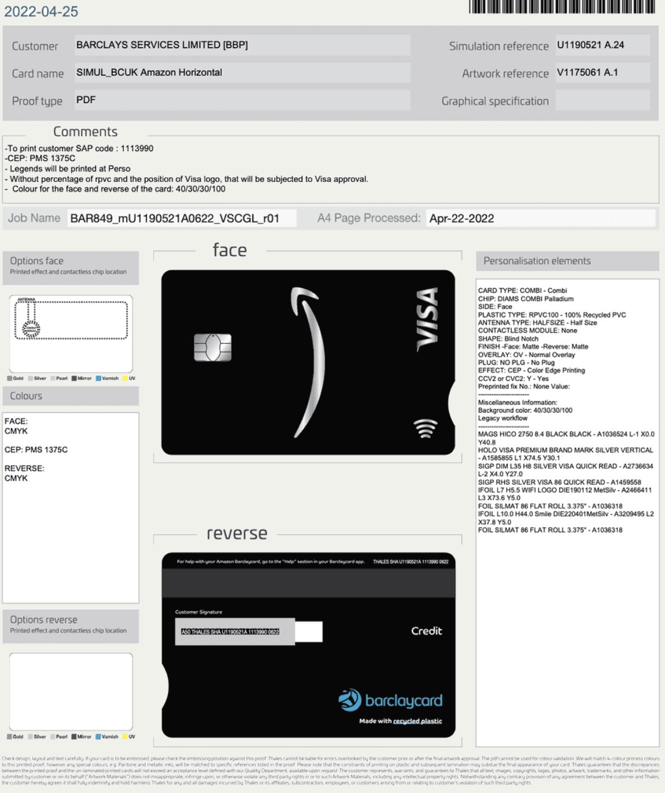
Following the validation research, I iterated on the designs and prepared them for manufacturing. I collaborated closely with the Visa to ensure compliance with their requirements, advocating for exceptions when necessary. I also worked with Thales, the card manufacturer, to select premium materials and finalize detailed proofs and specifications. The final card design has since been reused across several geographies, including Germany and Japan, demonstrating its scalability and success.
08Impact and customer feedback
The relaunch of the Amazon Barclaycard drove meaningful improvements across the customer experience, leading to increased adoption and engagement. The redesigned application process resulted in an 8.3% increase in completion rates, an 11.7% reduction in time to submit, and a 34% decrease in application errors. Introducing on-Amazon card servicing gave customers greater visibility and control over their benefits, while the enhanced branding helped position the card as top-of-wallet.
These changes were well received by customers, reflected not only in direct feedback but also in the card’s strong 4.1-star rating. Users highlighted the seamless application process, ease of use, and overall satisfaction with the experience:
- Cool looking card: Easy application, no problem with the app or making payments online, easy adjustment of limits on the card to keep full control of spending. Easy to make payments to the balance on account. Like it a lot. 🖖 And bonus money-off vouchers which you collect with spending anything with Amazon points to convert to credit."
- Easy application and kept informed all the way through the process: Easy application and card arrived when I was told it would. I was kept informed throughout the process. I have used it shopping for the first time.
- Super easy application - great app: The application process was very efficient and the coms and support first rate - very happy.
Next project: Housebets →