Revae
Brand identity and launch site for Revae Beauty, a premium commerce platform for luxury beauty that rescues discarded inventory and reintroduces it through a curated, elevated shopping experience.
Brief
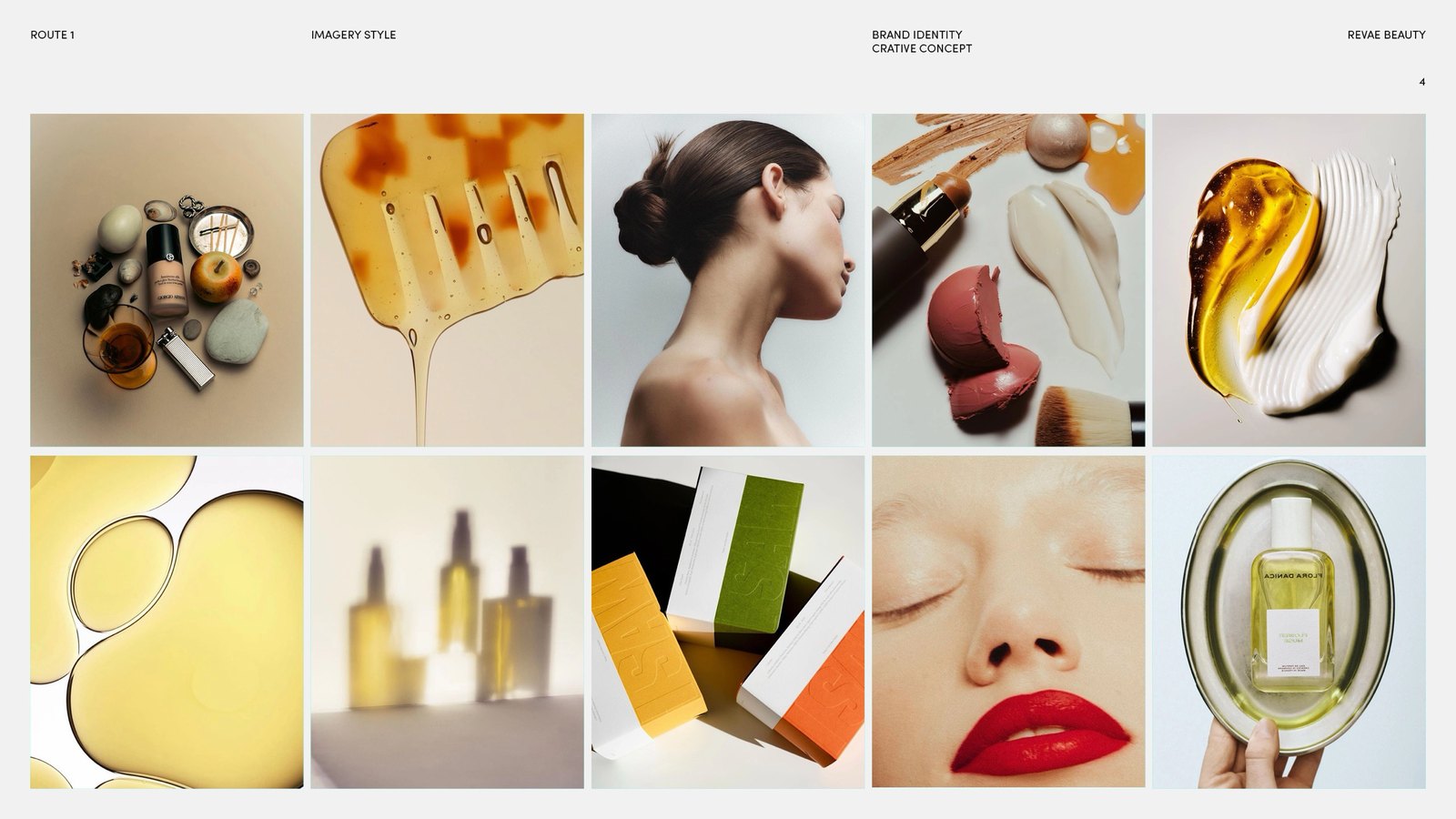
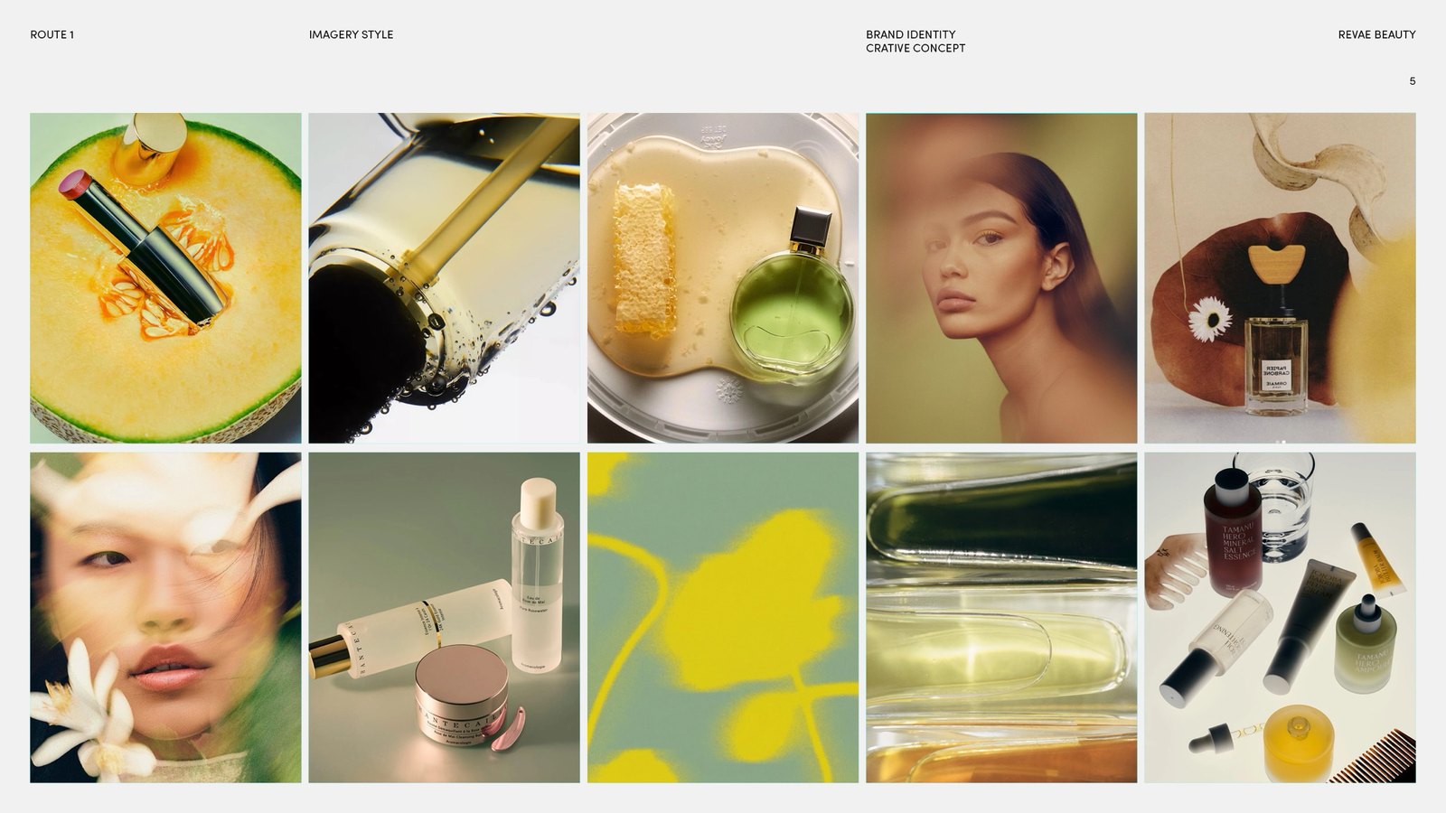
This route explores the idea of transformation. Rather than focusing on waste or sustainability, it reframes surplus beauty as something valuable and desirable. The visual language draws on fluidity, light and renewal to create a premium expression of circular beauty.
Outcome
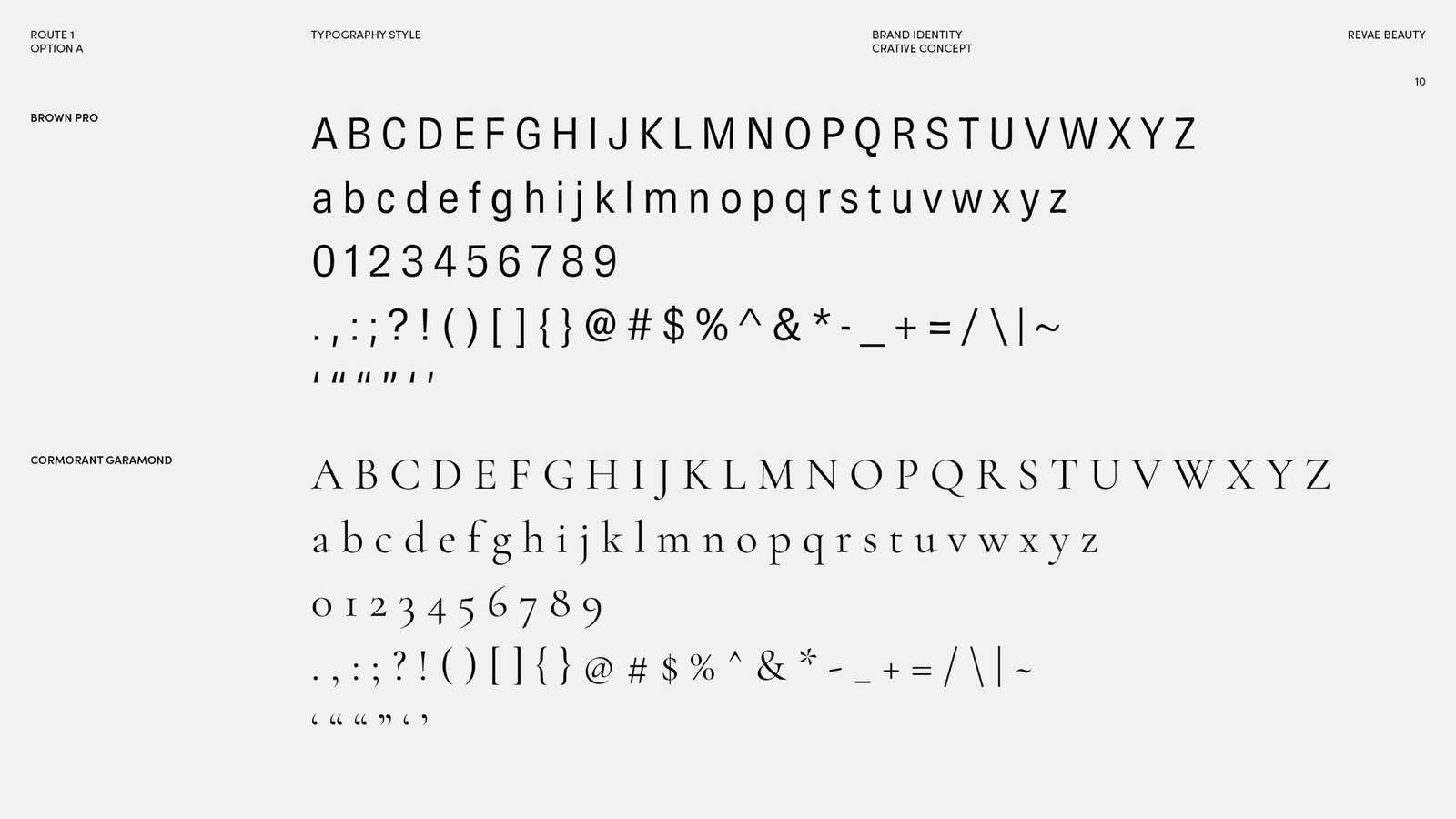
Brand Identity V2 adopted: Route 1, The Second Life, with the Option A icon and wordmark, Brown Pro and Cormorant Garamond. The launch-list site is live at revae-beauty.com ahead of the 2026 launch.
My role
Taking Revae from zero to launch across brand, product design and front-end.
Toolkit
- Design:
- Keynote · Figma
- Build:
- HTML, CSS and JS · Claude Code
01Route 1: The Second Life
This route explores the idea of transformation. Rather than focusing on waste or sustainability, it reframes surplus beauty as something valuable and desirable. The visual language draws on fluidity, light and renewal to create a premium expression of circular beauty.
Circularity through transformation. Transformative · Elevated · Fluid.
02Palette and type
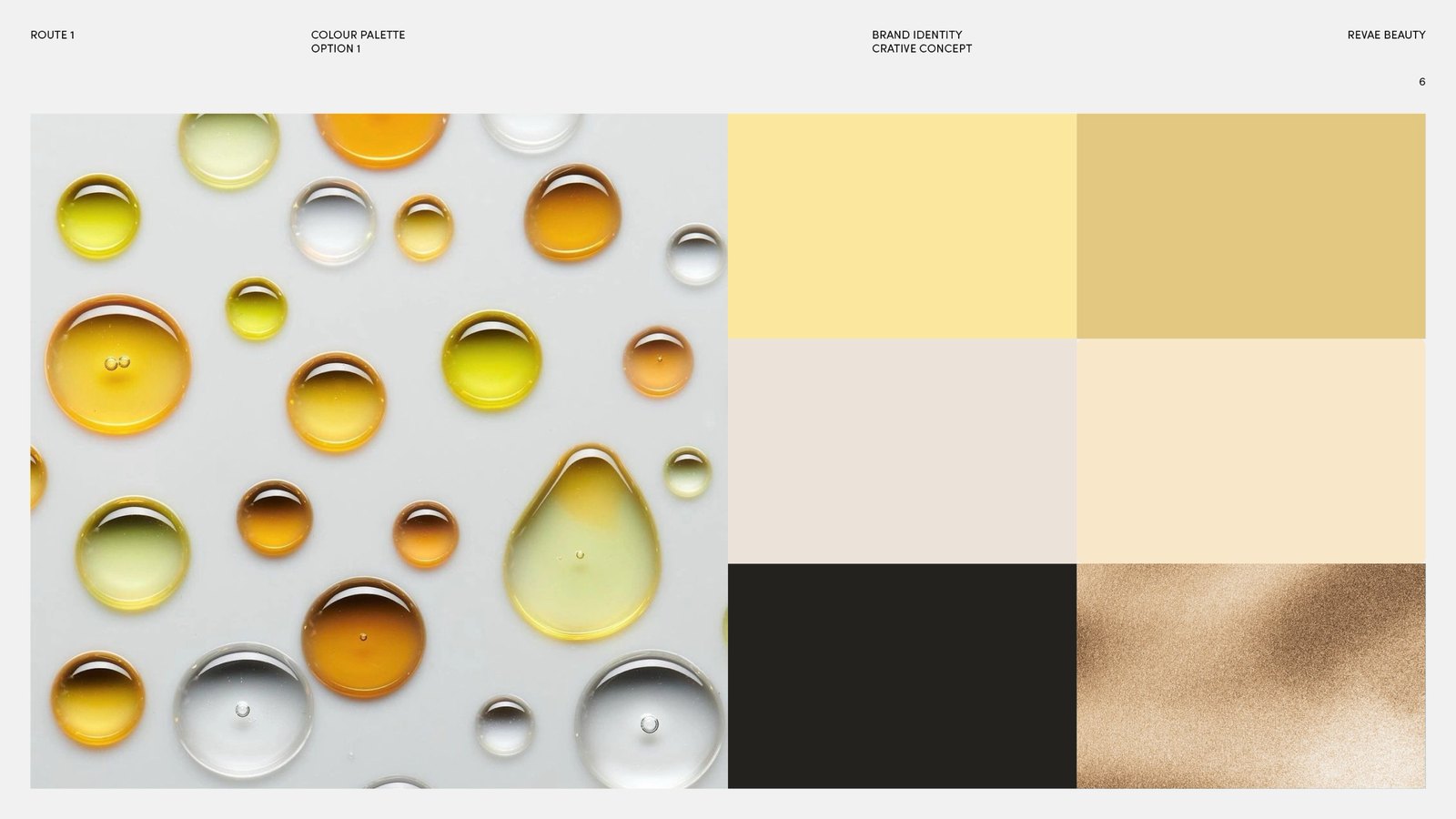
Option A sets Brown Pro against Cormorant Garamond; Option B, Instrument Serif against Inconsolata. The palette is butter, mustard gold, warm grey, cream and near-black, finished in gold or silver foil.
03Mark and wordmark
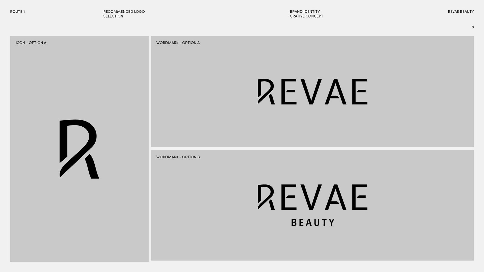
The recommended lockup pairs the Option A icon, an R with its stem cut through, with the Option A wordmark.
04In use
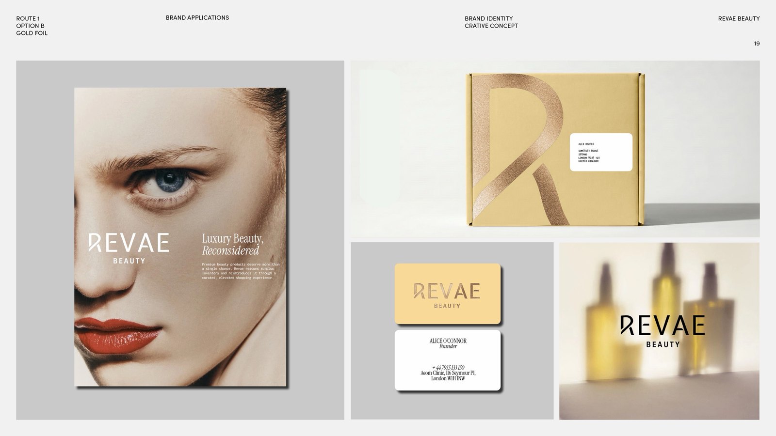
05Launch site
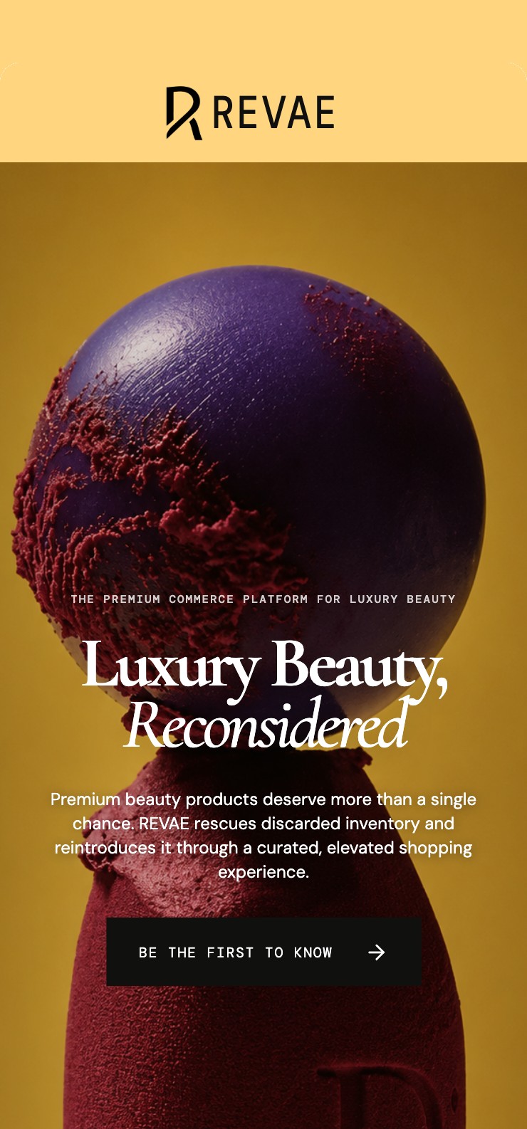
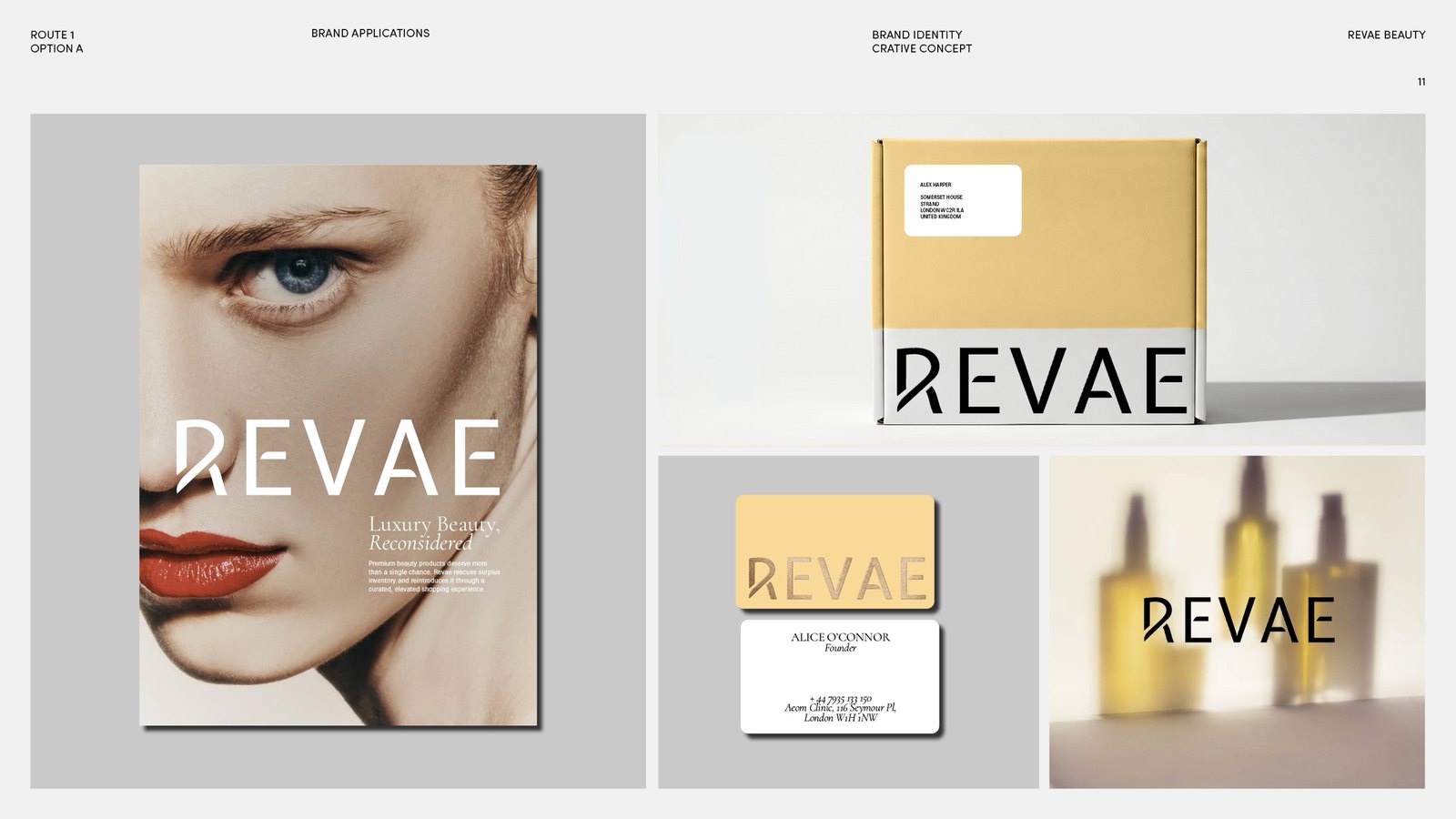
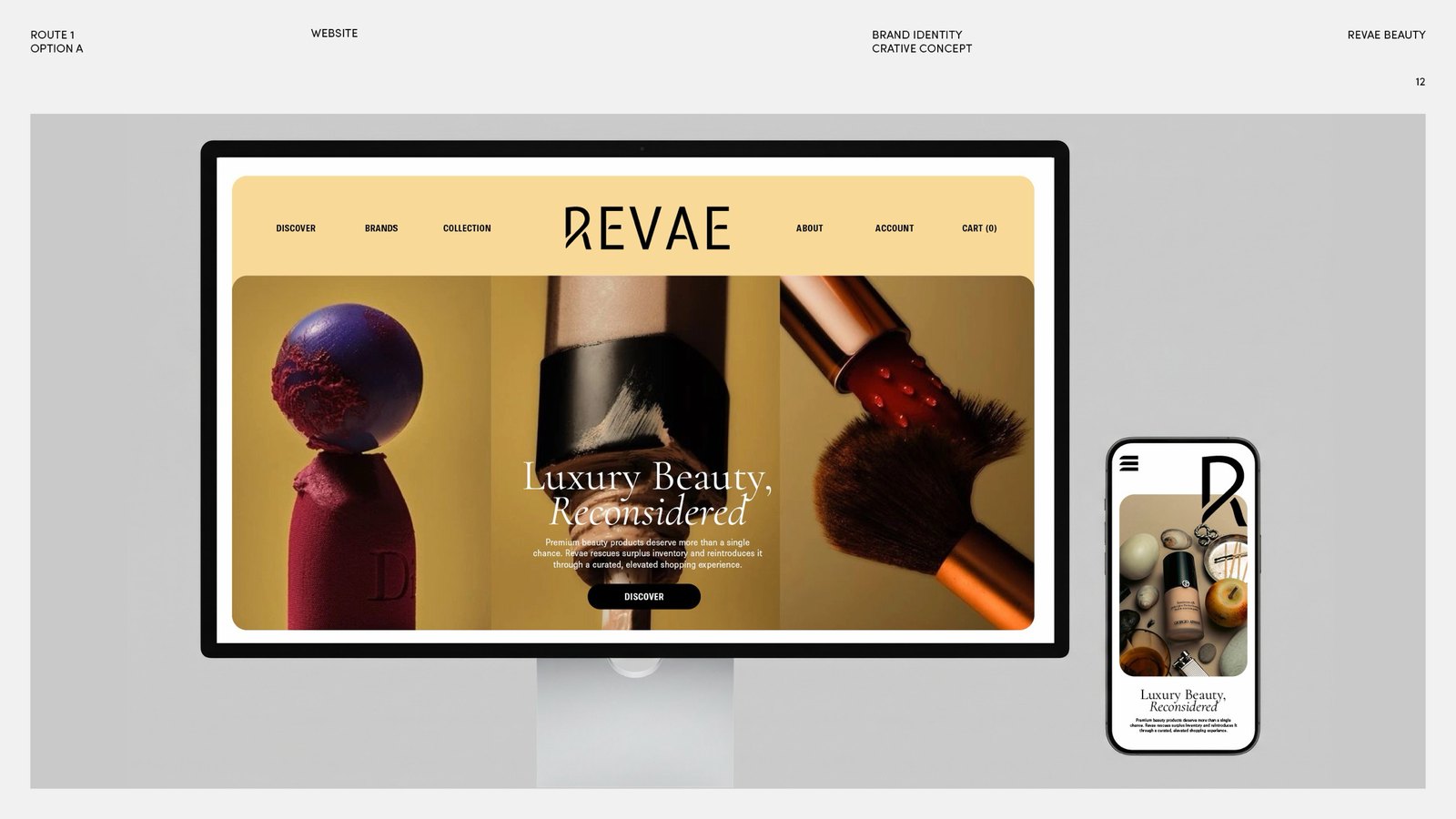
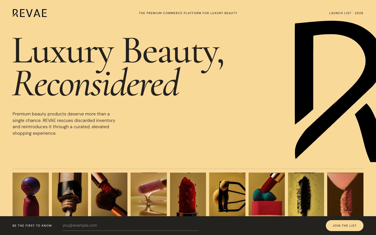
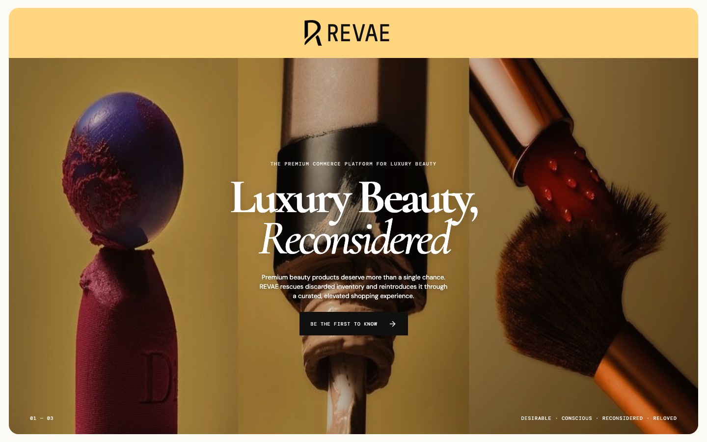
Luxury Beauty, Reconsidered. Premium beauty products deserve more than a single chance. REVAE rescues discarded inventory and reintroduces it through a curated, elevated shopping experience.
The launch-list page is a plain static site: three pages, no framework, no third-party requests, self-hosted type and a native dialog for the sign-up.
External links
Next project: The Amazon Barclaycard →